Using colour to promote positivity by steering clear of the January blues

Much has been said about how 2016 wasn’t the best of years (Bowie, Brexit, Beaten by Iceland in the Euros etc.), so what better way to start 2017 than with some much needed positivity and even marketing can do its bit to help!
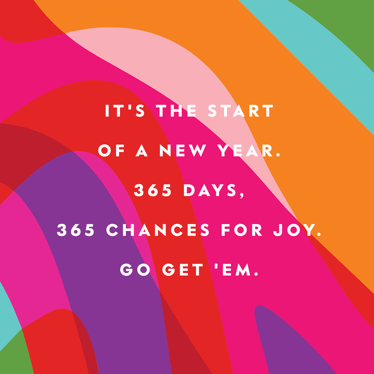
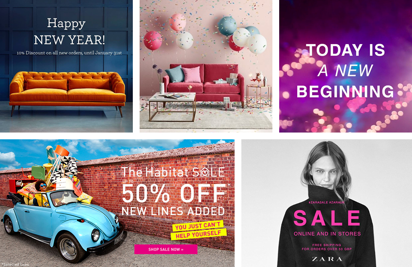
2017 promises a lot. Fresh in our memories is the much-loved John Lewis Christmas advert for example. The popular (watched 24 million times on YouTube alone) Buster The Boxer advert used positivity in its message with oodles of feel-good factor avoiding the much criticised ‘sadvertising’ of the previous year. Other brands have also noticeably taken to pushing positivity with uplifting New Year messages across social media (thankfully avoiding my pet hate of the ‘beat the January blues’ cliché) designed to brighten their customers’ inboxes and daily feeds previously saturated with wintery interior schemes and Christmas present ideas. Zara and Kate Spade’s bright and positive Facebook posts are examples of a positive message presented with bold energetic colouring.

Supporting Getty Images’ prediction of a colour surge for 2017 relating to colourful photography, many other brands have used colour to promote positivity for the coming year. This trend is also certainly evident within graphic design too. Both Habitat and Zara have chosen bright pinks for their January Sale campaign graphics giving us a much needed colour lift as we emerge from a yuletide sea of reds and greens!
Using bright colour through brand and marketing is refreshing and can have positive impact on a brand, making it fun and engaging. Just because it’s drab and grey outside, it doesn’t mean what we choose to look at needs to be as well.
Here’s to a positive and colourful 2017, graphically or otherwise! Check out our Brand & Marketing pages to see what we’ve been up to!
Images taken from: Kate Spade, Love Your Home, Zara & Habitat
January 16, 2017 10:33 am


