2017 – The Rise of the Playful Interior?
At the end of 2015 leading manufacturer of premium quality paint, Benjamin Moore, announced that Simply White was to be its Colour of the Year for 2016. Meanwhile for the first time ever, colour communications expert Pantone declared that coordinating shades Rose Quartz and Serenity had been selected to take the coveted colour crown. The influence of these two brands was obvious and immediate; the year was dominated by off-whites, soft pastel tones and new neutral shades. But now, that focus on light hues and pastels has shifted. The gentle shades and muted colour palettes that dominated design schemes for the past year have been replaced by none other than the amped-up versions of themselves.
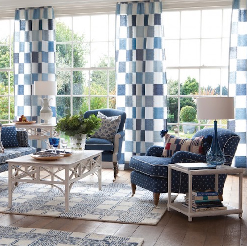
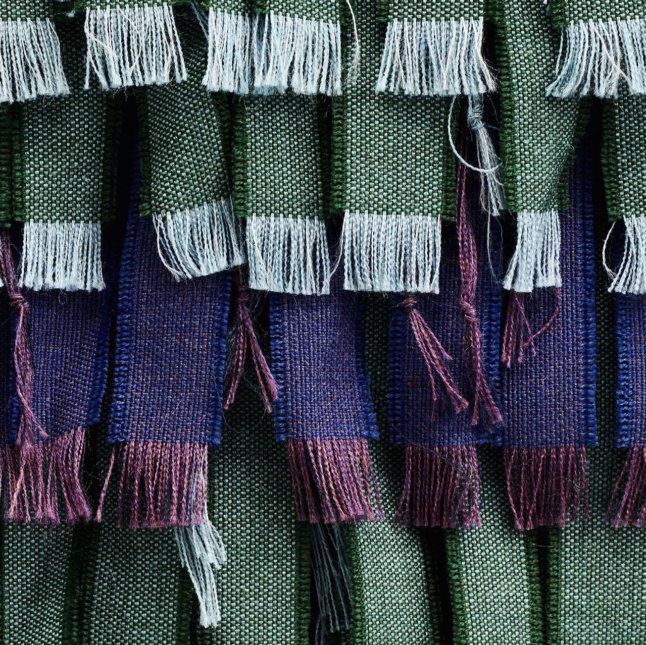
Rose Quartz and Serenity were both described by Pantone as the antidotes to modern day stresses, and this continuing need for peaceful colour tones runs through into the AW16/17 collection. In this year’s Colour Report, new colours on the block Airy Blue and Bodacious have added a refreshing twist to the primarily earthy palette that also saw mustards, reds and forest greens take centre stage. Inspired by the desire for tranquillity and optimism, the collection offers a structured yet playful departure away from the stereotypical Autumn shades we have come to expect. Both Airy Blue and Bodacious offer bolder alternatives to the colours of year, and it is that lively edge which we can expect to see interiors take hold of firmly next year. The use of greys, greens, and blush-based neutrals this year have laid the foundations for a more inventive approach to colour, and Pantone’s collection is only further evidence of this style evolution.
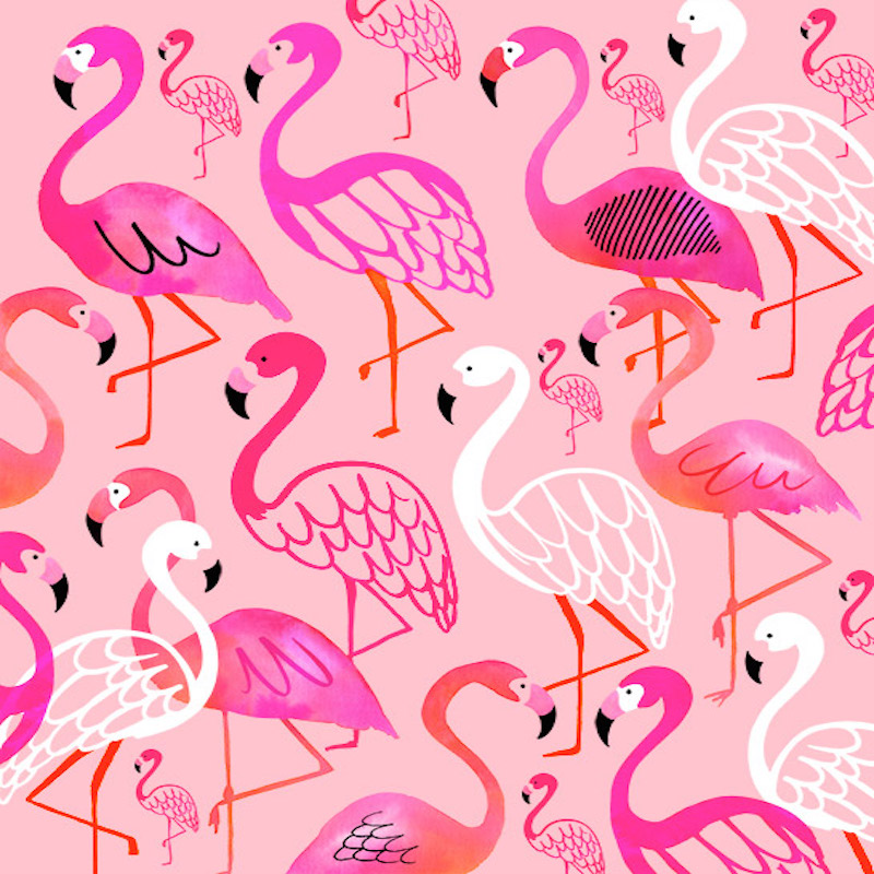
That being said, this fun approach to colour and print isn’t just limited to interiors, we are seeing this across all fashion and style platforms. Pantone isn’t the only brand carefully influencing new and emerging trends. In fact some fashions emerge without stemming from industry experts and leaders. The pop-art emjoii–influenced trend for bright pink flamingos and festival-inspired cacti can be traced back to its rise in use on social-media earlier this year. Arguably the visual icons of the summer, these unique yet light-hearted designs again mark the change in approach to interior design. Readily embraced by the high-street and mainstream media the cactus and watermelon emojis featured on ceramics, soft furnishings and even made it onto Pradas SS16 catwalk show.
So, with all that considered, what can we expect to see in 2017? Interior design will continue its newly found playful streak, with jewel-toned metallics such as Lucite and Opal embodying the optimism that stemmed originally from Rose Quartz and Serenity, and developing it to have a more sophisticated edge. The trend for natural materials in the home will shift slightly, as terracotta and cork hues look set to gain in popularity, whilst industrial pewters and steel greys will phase out the polished aesthetic of warmer rose golds and coppers that have lead trend-pages for the last two years. Of course, there are always crazes that pop up that are unpredictable, but no matter the trend, or your own personal style preference, 2017 looks certain to be another exciting year for interior design!
Header image credit: Margaret Begart
September 20, 2016 9:59 am