Pantone Colour(s) of the Year – Rose Quartz & Serenity
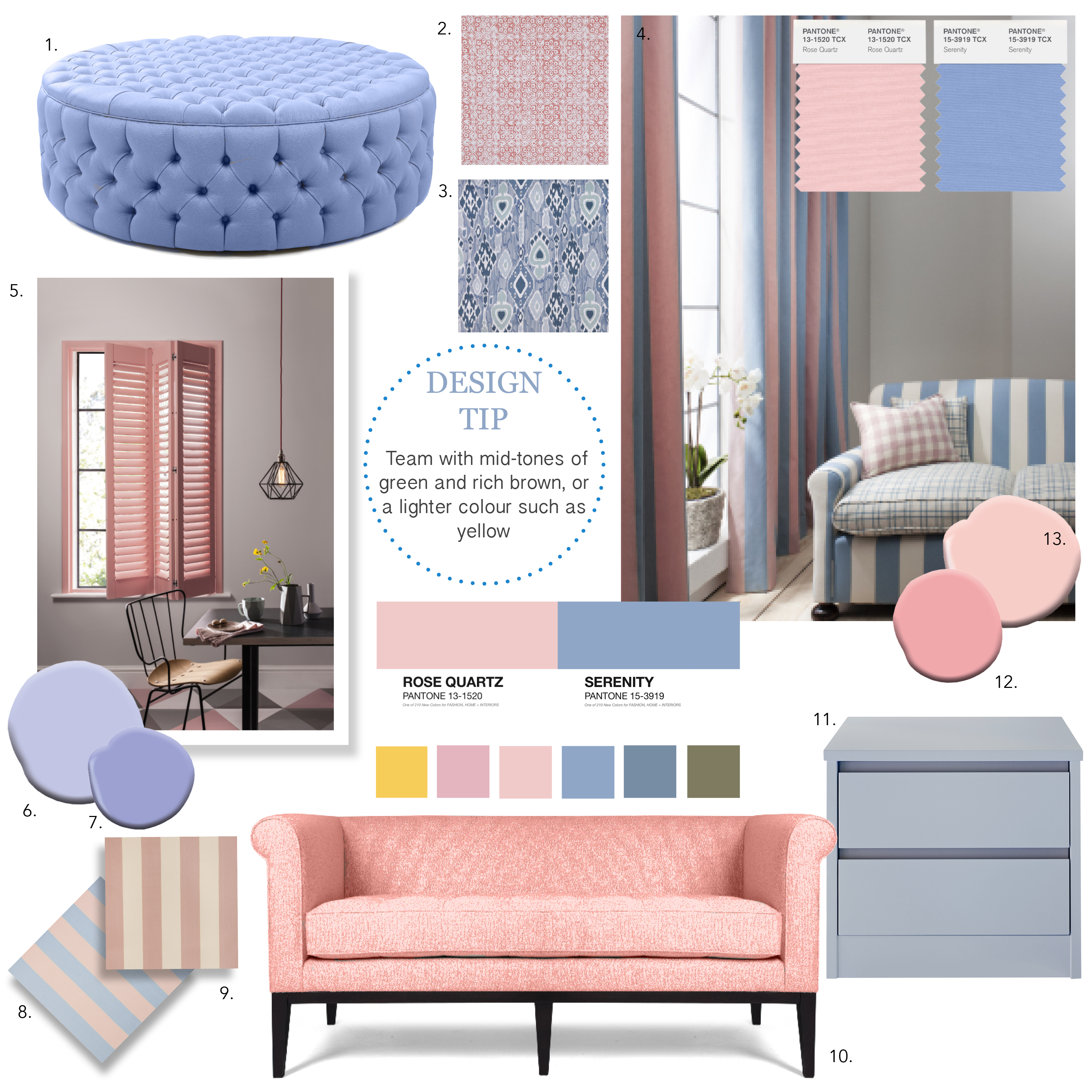
After a much-anticipated wait, colour communications expert Pantone has unveiled its Colour(s) of the Year for 2016– and for the first time ever, two coordinating shades have been selected to take the colour crown! A softer take on palettes for 2016, Rose Quartz and Serenity offer a touch of modern romance alongside a sense of well-being that will take us effortlessly through the seasons in both our homes and wardrobes.
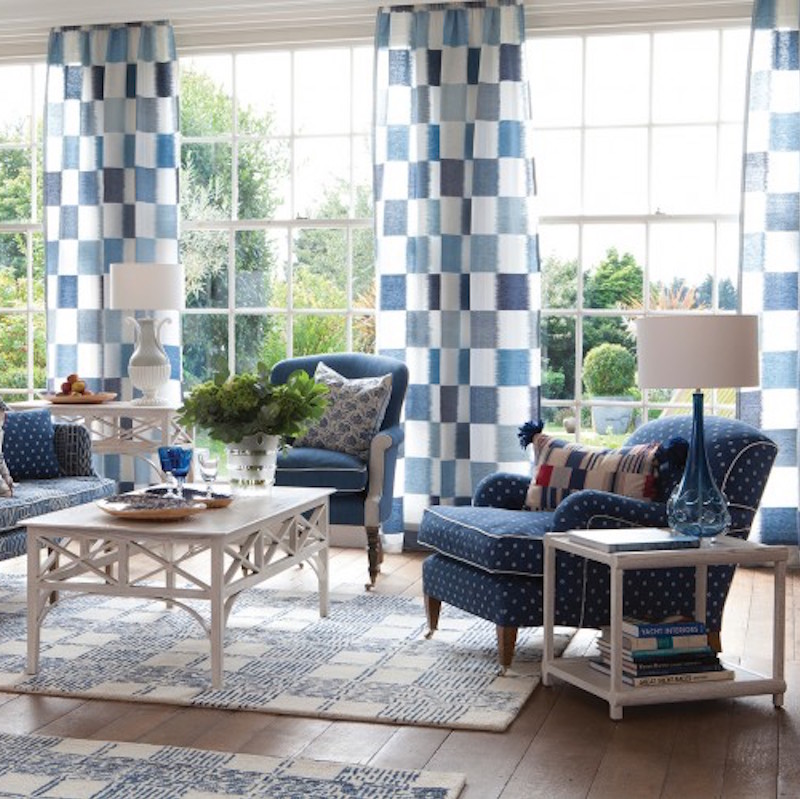
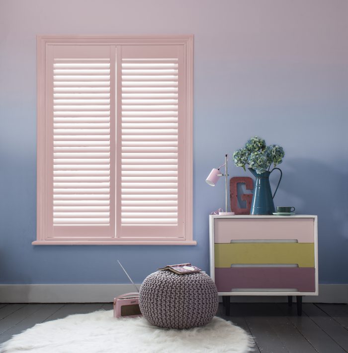
Described by Pantone as ‘an inherent balance between a warmer rose tone and the cooler tranquil blue’, these complementary tones ‘reflect connection and wellness, as well as a soothing sense or order and peace’. Challenging gender roles, the amalgamation of these two contrasting tones creates a colour blur that, in turn, develops into a new understanding of ‘pink’ and ‘blue’. Often perceived as a typically “feminine” colour, the sweetness of the blush pink tone is supported and strengthened by the lilac undertones of the blue, ensuring that both colours work just as well for Spring and Summer as they do for the darker months. Team with mid-tones of greens and purples, rich browns and all shades of yellow or pink to achieve variances in the overall look: from light and uplifting to a more sultry and stormy interpretation of the trend.
For more Rose Quartz and Serenity inspiration, make sure to check out our Pinterest page here
September 20, 2016 9:15 am