ITWR predicts Next Year’s Hottest Colour Trend
It’s that time of year where we start to look ahead to next year’s hottest interior trends! In the interiors world, colours are constantly coming in and out of fashion, so we did a little whip round the office to see exactly what the ITWR team thinks will be the next big colour trend!
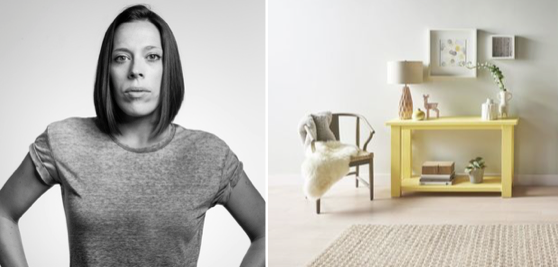
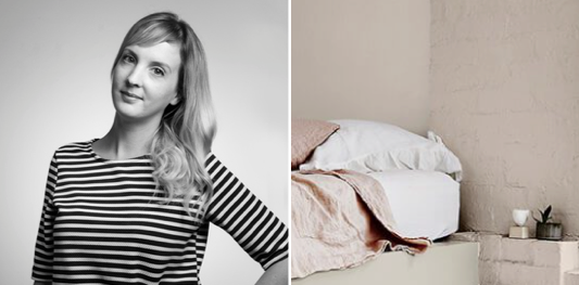
Abi – Creative Projects Manager
Colour Prediction: Dusted Yellow
Grey always features highly on my list when decorating but with one careful consideration – choosing a complementary colour to energise a room. Whether pairing it with a muted or deep grey 2017’s choice for me is dusted yellow. Everyone needs a ray of sunshine in their lives and this one does it for me!
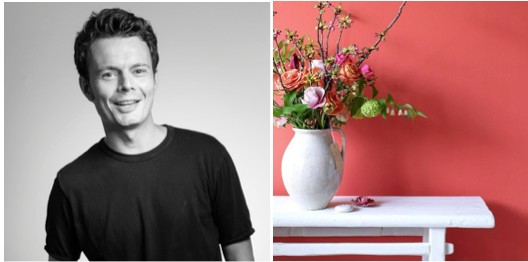
Matt – Senior Designer
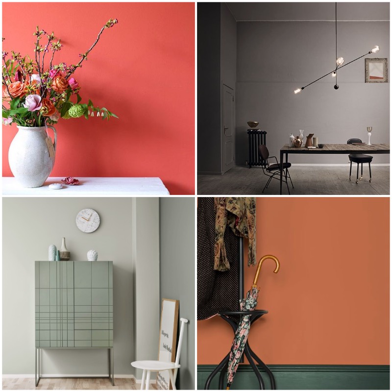
Colour Prediction: Bold Coral
I predict to see more dramatic and eye-catching tones such as this Bold Coral colour as a way of popping out and complementing graphic whites and blacks, whilst also giving interiors a real warmth. Also, in design, I see this colour and tone being used more and more to soften the traditionally used bright reds to attract attention for Sale and Offer graphics etc.
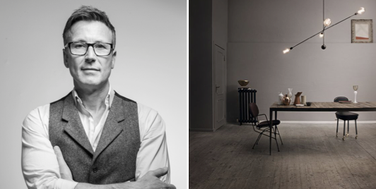
Colin Long – Managing Director
Colour Prediction: Warm French Grey
Next year, I imagine that we will continue to see the colour grey remain as popular as ever, but with a new twist. Warmer grey shades that have been heavily associated with whimsical European style will make their way over the channel and into our homes, giving us a refreshing but classically Parisian approach to both our choice of colour palettes and décor.
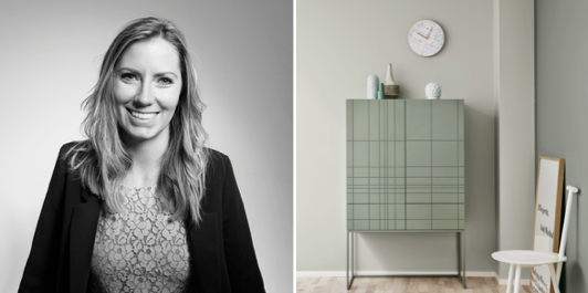
Gemma – PR Director
Colour Prediction: Chalk Green
Last year saw the influence of nature enter our homes more than ever before, from Rio-inspired leafy greens to organic raw materials, the interiors world went totally and utterly tropical. Taking a cue from our love for all things muted and combining it with this latest nod towards the shades of the great outdoors, I foresee a calming chalky green palette dominating our homes in 2017.
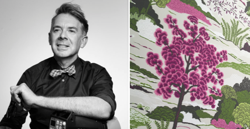
Chris – Artistic Director
Colour Prediction: Vibrant Magenta
I’m really excited to see interiors embrace colour again after 2016 being so heavily dominated by pastel tones. Colours always come and go, and its about time that the interiors world embraced magenta again! With today’s approach to interior design becoming more and more fashion-led, I’d be excited to see what stylists would do with this. Personally, I love it when its paired with citrus greens, it really adds that bold eclectic to a home!
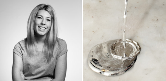
Kat – PR and Social Media Account Executive
Colour Prediction: Rust Orange
I predict that next year’s colour will be a dark, earthy orange. Natural materials have dominated interior trends over the last year, and I think that will continue, but with the focus shifting to Mediterranean textures like terracotta and cork. You heard it here first!
Lily – PR and Social Media Account Manager
Colour Prediction: Silver/ Anything Metallic
The future is bright, the future is (not orange – sorry Kat)! Don’t give metallics the elbow just yet, this season designers’ will be taking a space-inspired adventure and welcoming shimmering shades of silver into interiors. Reflecting ongoing tech developments, futuristic furniture and clean chrome lines are the perfect complement to today’s smart (and stylish) homes!
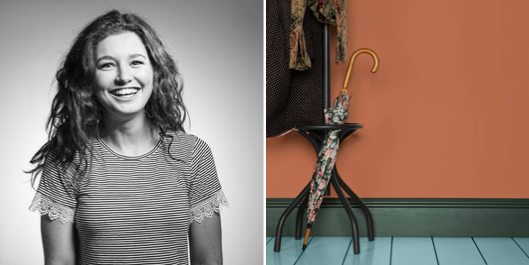
Claire – PR Senior Account Manager
Colour Prediction: Putty Pink
Having seen grey dominate our interiors for so long, we’re now craving a shift to softer, more whimsical palettes. Paired with crisp whites and natural textures, this romantic putty shade offers an effortless transition from the abundance of grey, to create a space that evokes a sense of serenity and understated style.
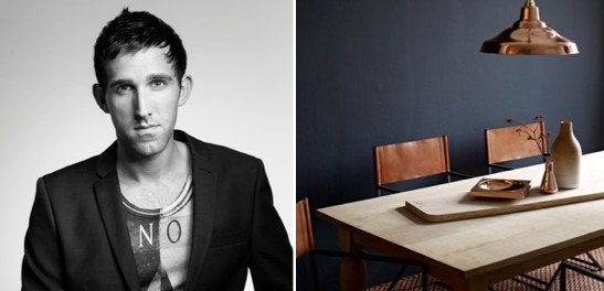
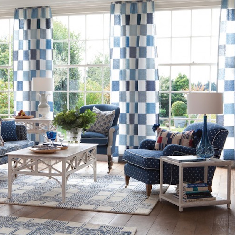
Tom – Designer
Colour Prediction: Slate Blue
These deep blues bring a rich and dramatic atmosphere to your space and textures such as copper and brass pair beautifully. The perfect strong bold tone to settle brighter highlights in the home, it’s the perfect alternative to charcoal but with an elegant touch.
October 11, 2016 9:05 am